Design Riot
Design takes a side.
Context
We live in times of climate crisis, inequality and polarization, where graphic disciplines can no longer stay on the sidelines.
Design Riot is born as a response: an event that sees design not as aesthetics, but as a tool for social change.
Brief
Develop the brand identity and communication strategy for a fictional design event with a political position.
It is aimed at designers and graphic artists with a critical attitude, not at a general festival audience.
The campaign
The concept “Design takes a side” presents the brand as a declaration of war against indifference.
The manifesto defines it as “the uprising of design,” not just another festival.
Before defining any visual element, I set the verbal tone (provocative, clear, inspiring, critical) so every piece of communication spoke with the same voice.
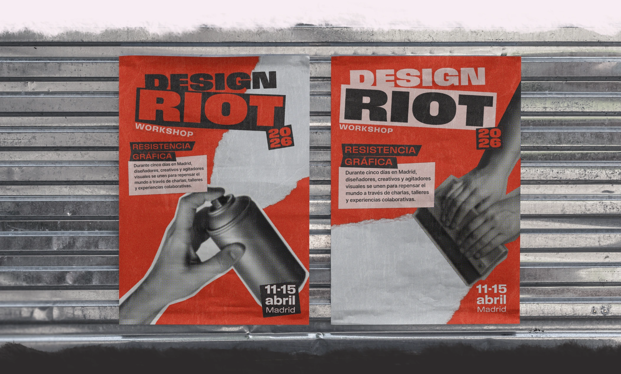
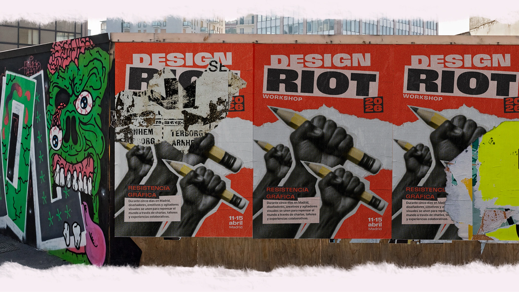
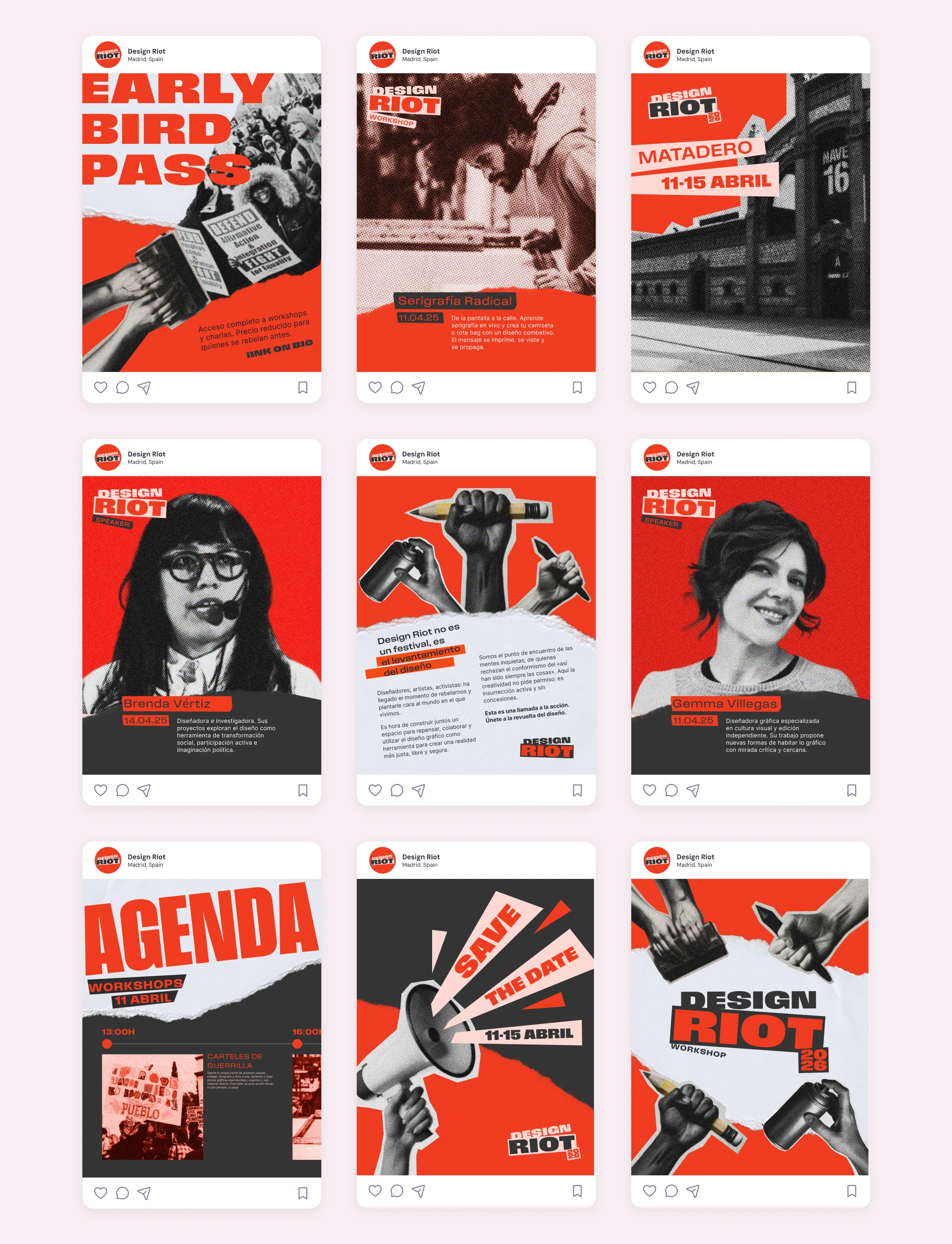
The strategy had two phases: launch and conversion (paid media, landing page, DOOH, sticker bombing) and retention and loyalty (email marketing, live coverage, merchandising, attendee content).
Art direction
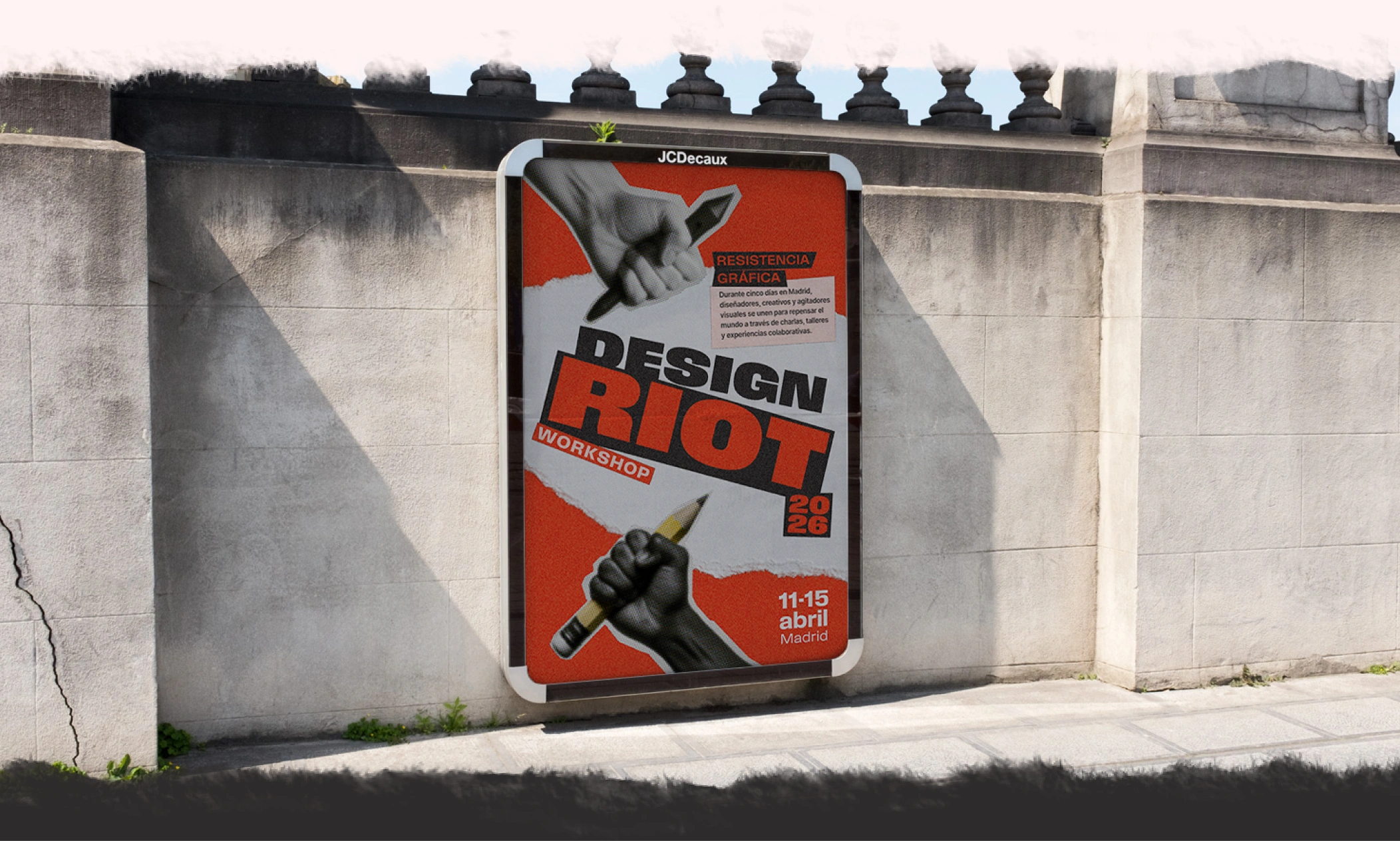
The visual challenge was to communicate rupture and urgency without falling into the cliché of generic protest design.
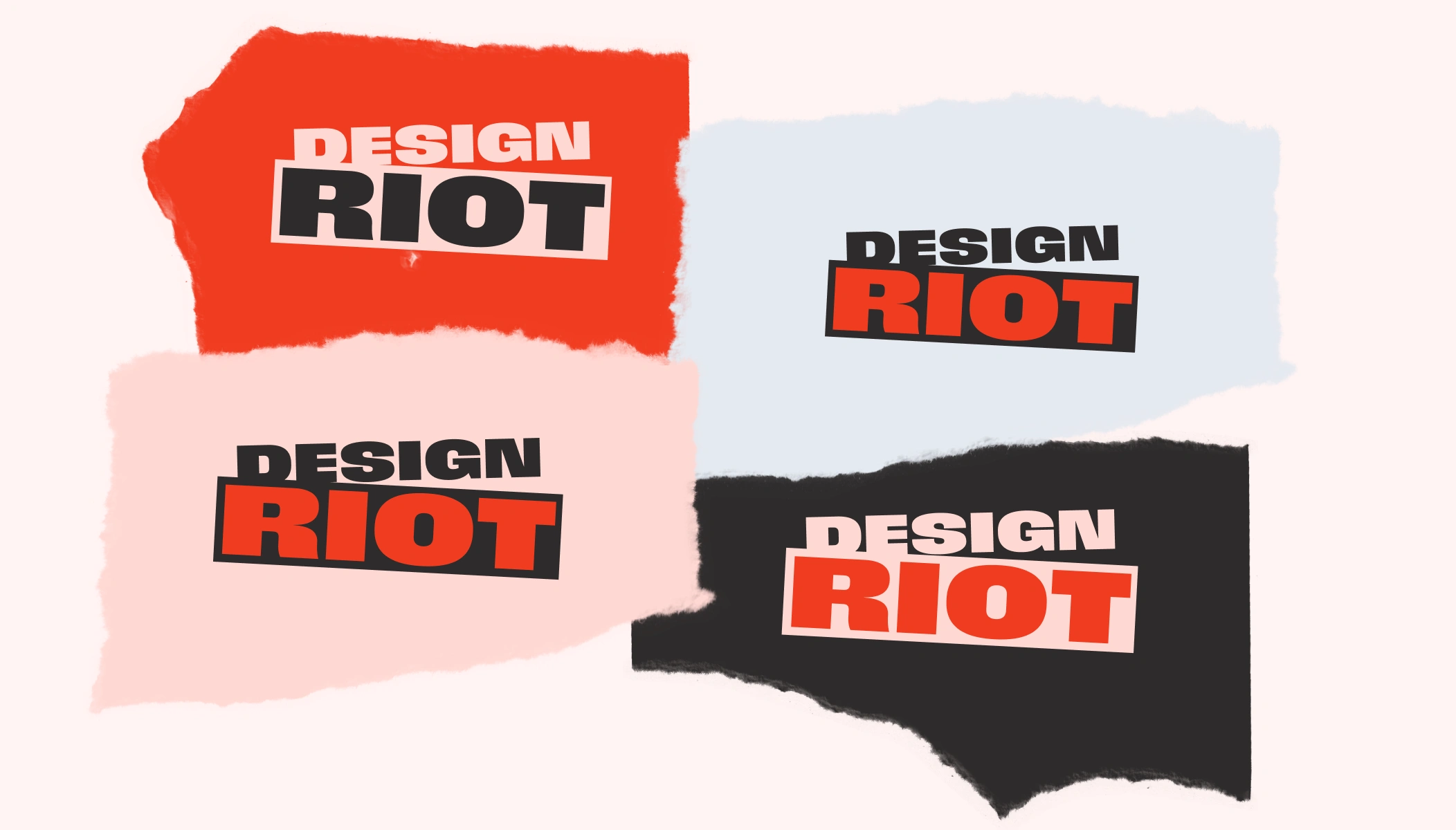
I started with the logo: an extended bold typeface with a misaligned frame, as a symbolic break with the status quo.
From there, I treated color as a narrative tool, not a decorative one. Active red for urgency, shock black for resistance, resistance pink for vulnerability as a political act, and structural white for breathing room and hierarchy.
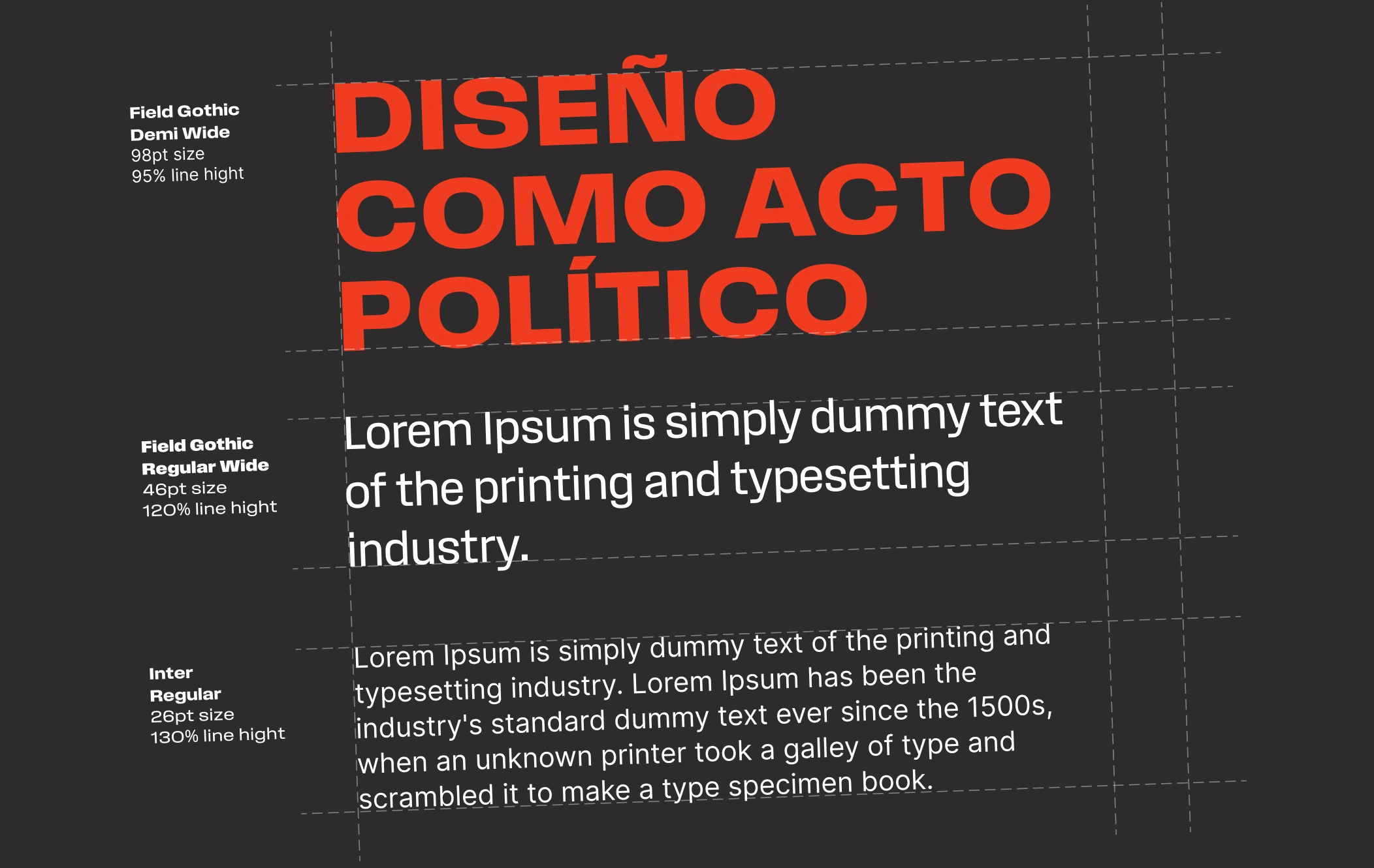
I combined Field Gothic for headlines (impact, weight, attitude) with Inter for body text (clarity, rhythm). I brought the same tension to the composition: asymmetric and directional structures, avoiding predictable grids.
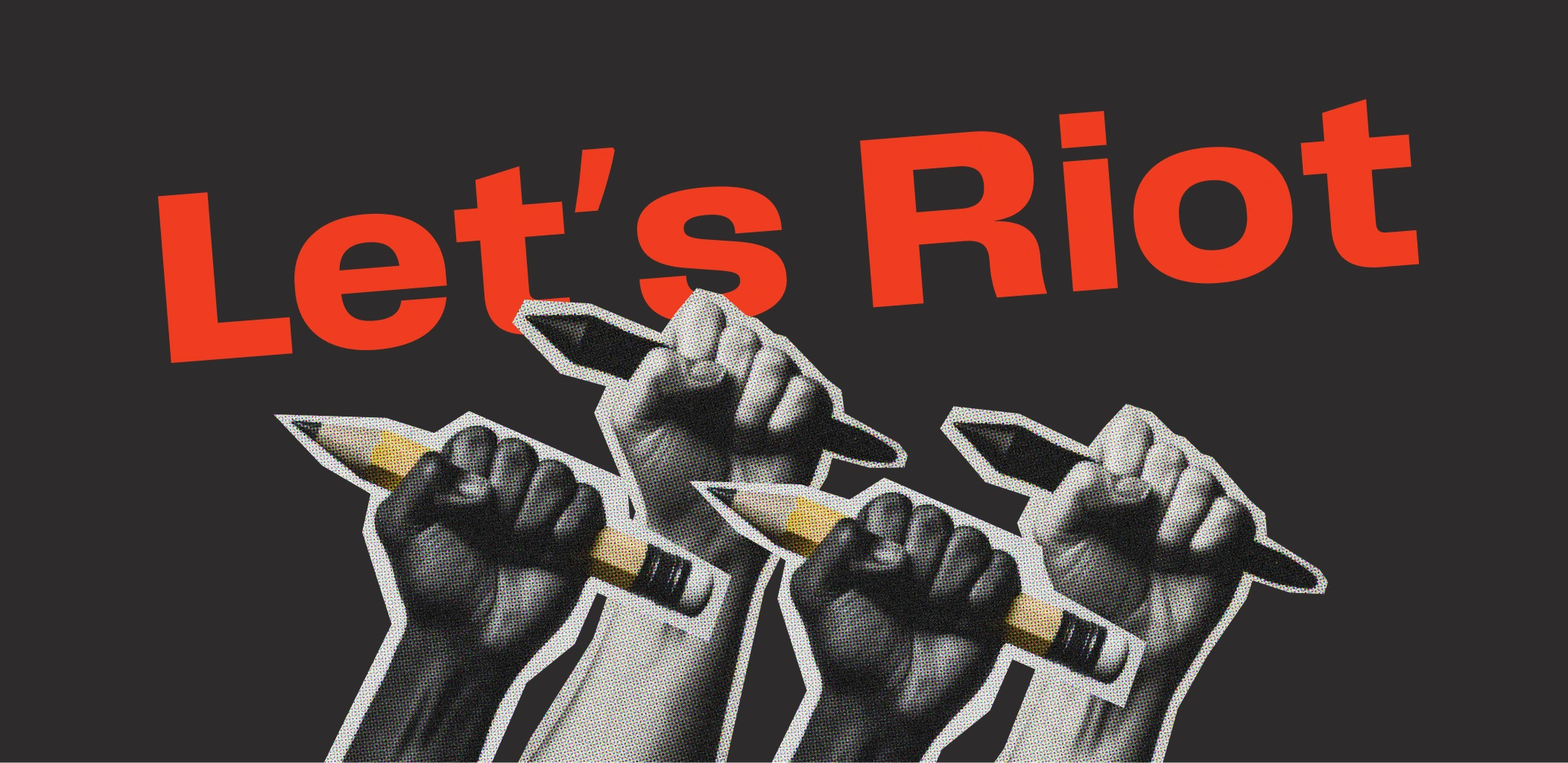
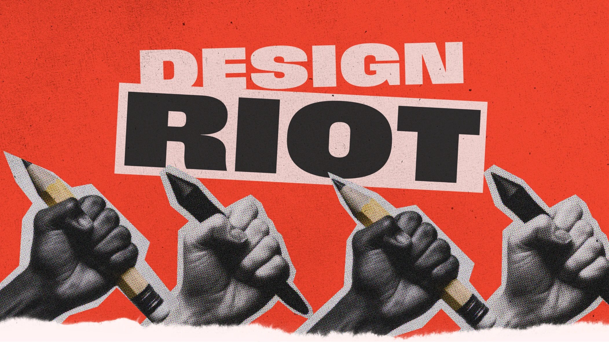
Collage photography in one ink and high contrast reinforces the same sense of urgency.
Design takes a side.
Context
We live in times of climate crisis, inequality and polarization, where graphic disciplines can no longer stay on the sidelines.
Design Riot is born as a response: an event that sees design not as aesthetics, but as a tool for social change.
Brief
Develop the brand identity and communication strategy for a fictional design event with a political position.
It is aimed at designers and graphic artists with a critical attitude, not at a general festival audience.
The campaign
The concept “Design takes a side” presents the brand as a declaration of war against indifference.
The manifesto defines it as “the uprising of design,” not just another festival.
Before defining any visual element, I set the verbal tone (provocative, clear, inspiring, critical) so every piece of communication spoke with the same voice.
The strategy had two phases: launch and conversion (paid media, landing page, DOOH, sticker bombing) and retention and loyalty (email marketing, live coverage, merchandising, attendee content).
Art direction
The visual challenge was to communicate rupture and urgency without falling into the cliché of generic protest design.
I started with the logo: an extended bold typeface with a misaligned frame, as a symbolic break with the status quo.
From there, I treated color as a narrative tool, not a decorative one. Active red for urgency, shock black for resistance, resistance pink for vulnerability as a political act, and structural white for breathing room and hierarchy.
I combined Field Gothic for headlines (impact, weight, attitude) with Inter for body text (clarity, rhythm). I brought the same tension to the composition: asymmetric and directional structures, avoiding predictable grids.
Collage photography in one ink and high contrast reinforces the same sense of urgency.