Madrid_ Decide
Your city. Your budget. Your call.
Context
Participatory budgeting lets residents of a city decide directly how part of the municipal budget is spent. They propose and vote on initiatives for their neighborhood or district.
Brief
Create an institutional campaign that invites people to take part, with a close and participatory tone, not a cold institutional one.
The campaign
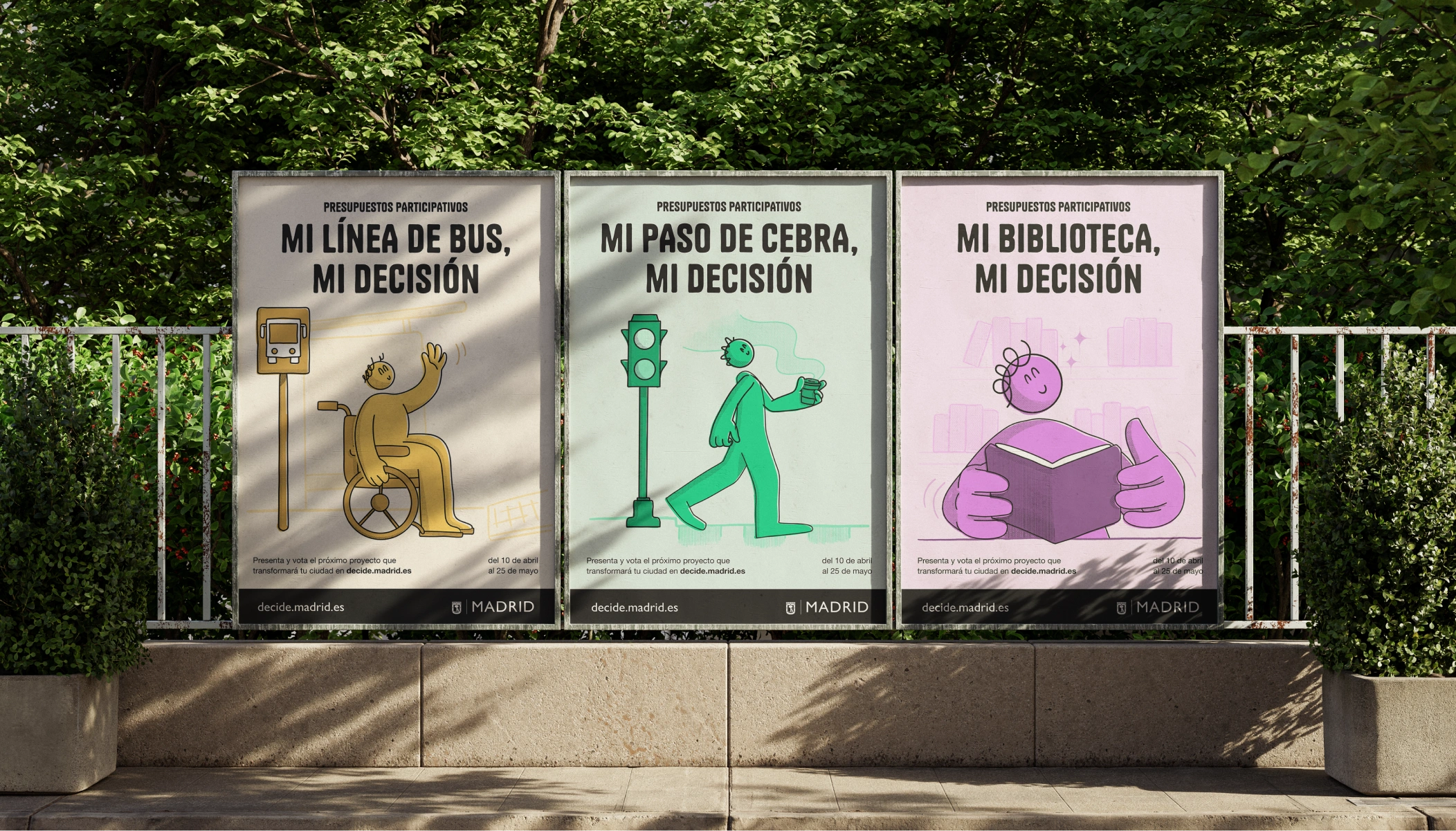
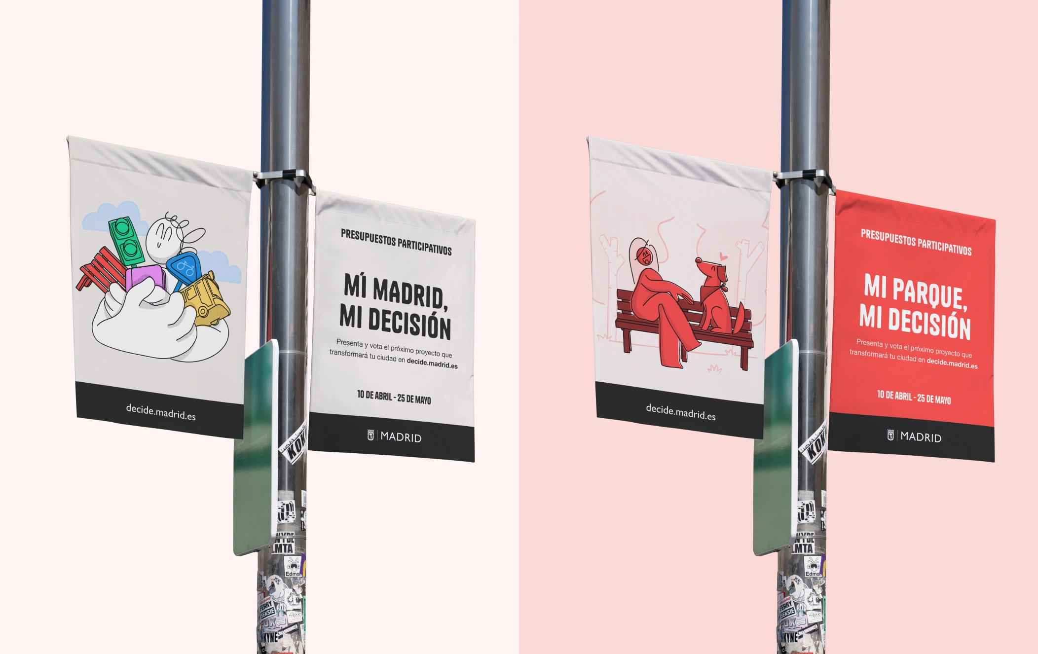
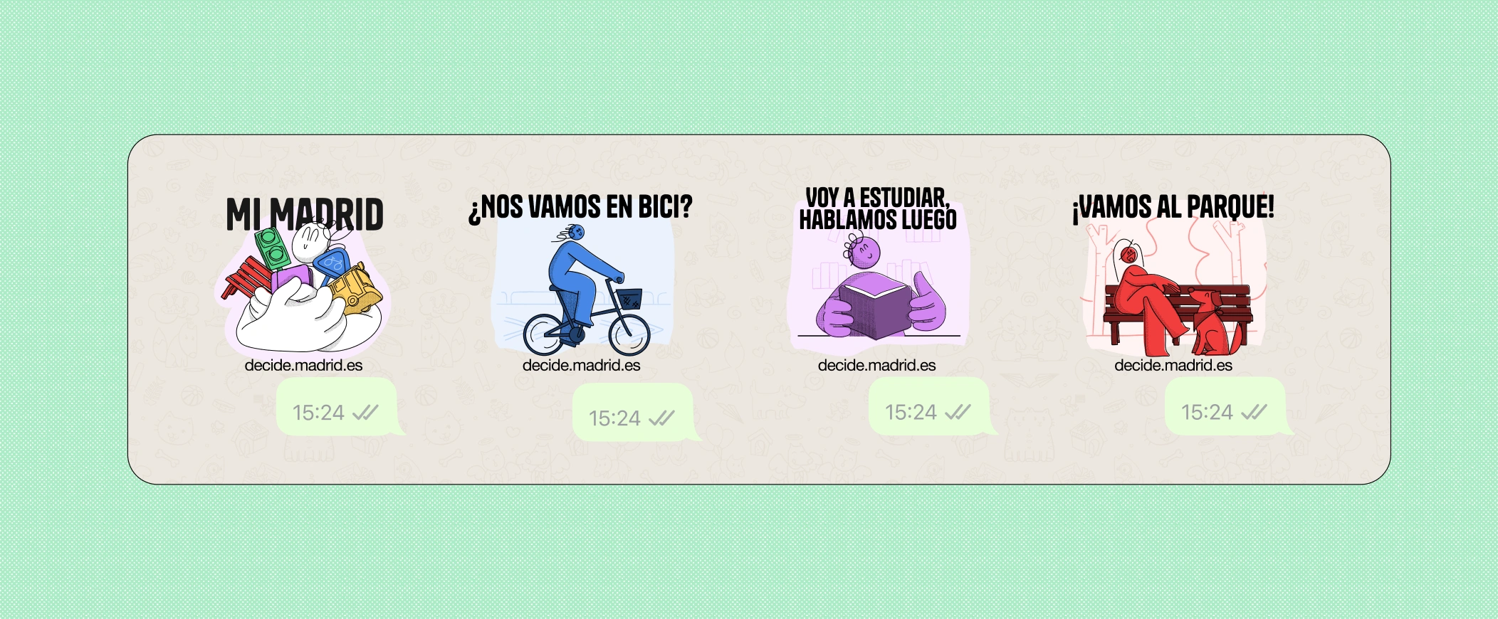
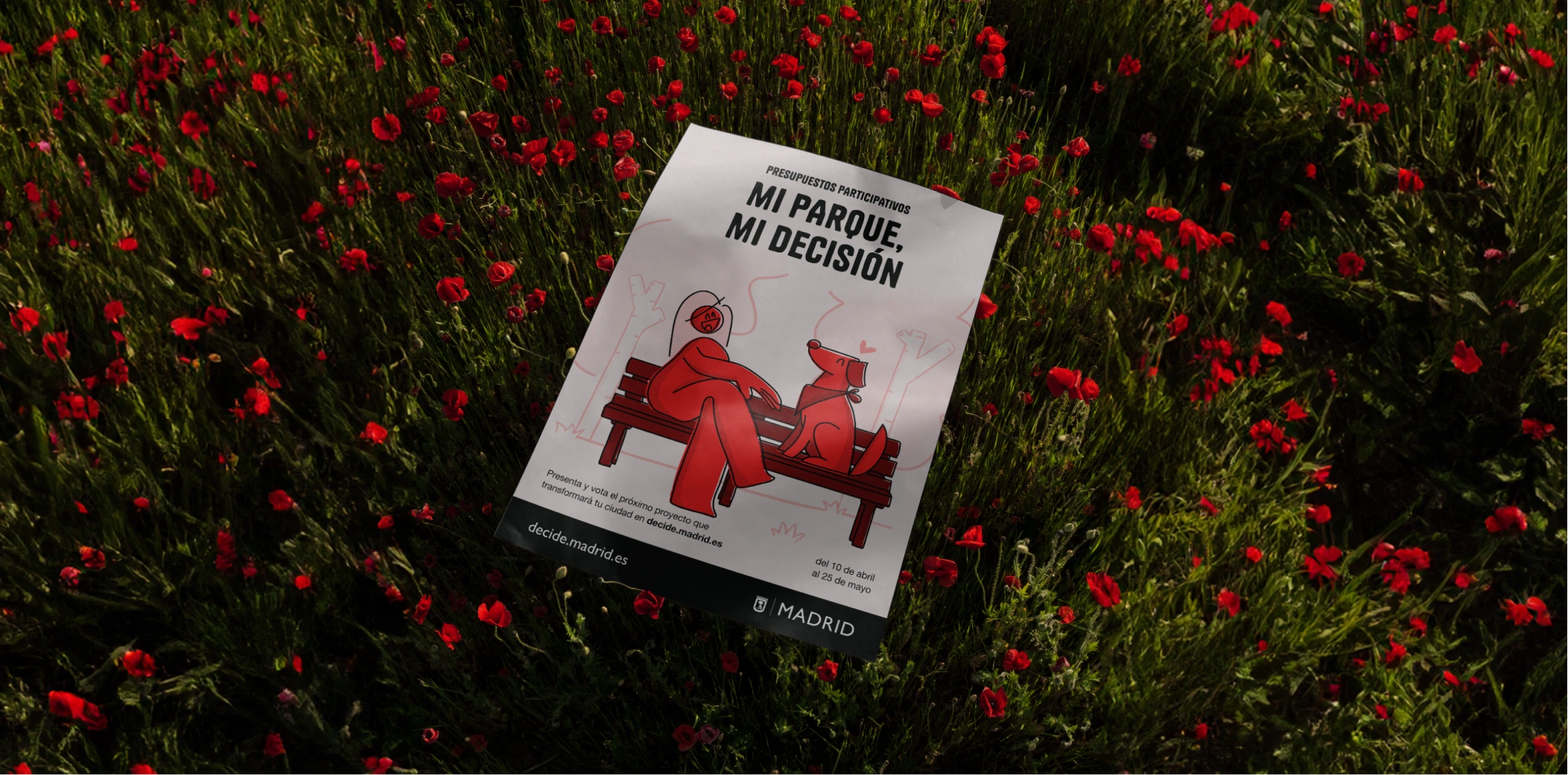
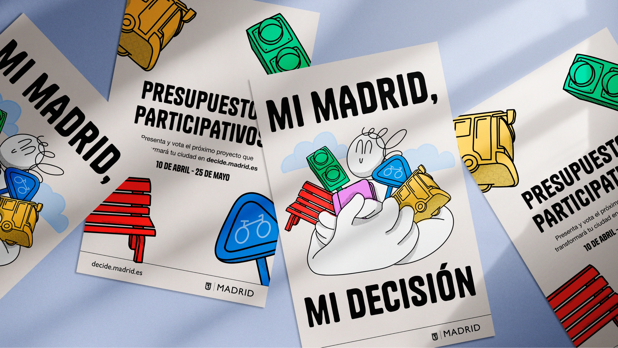
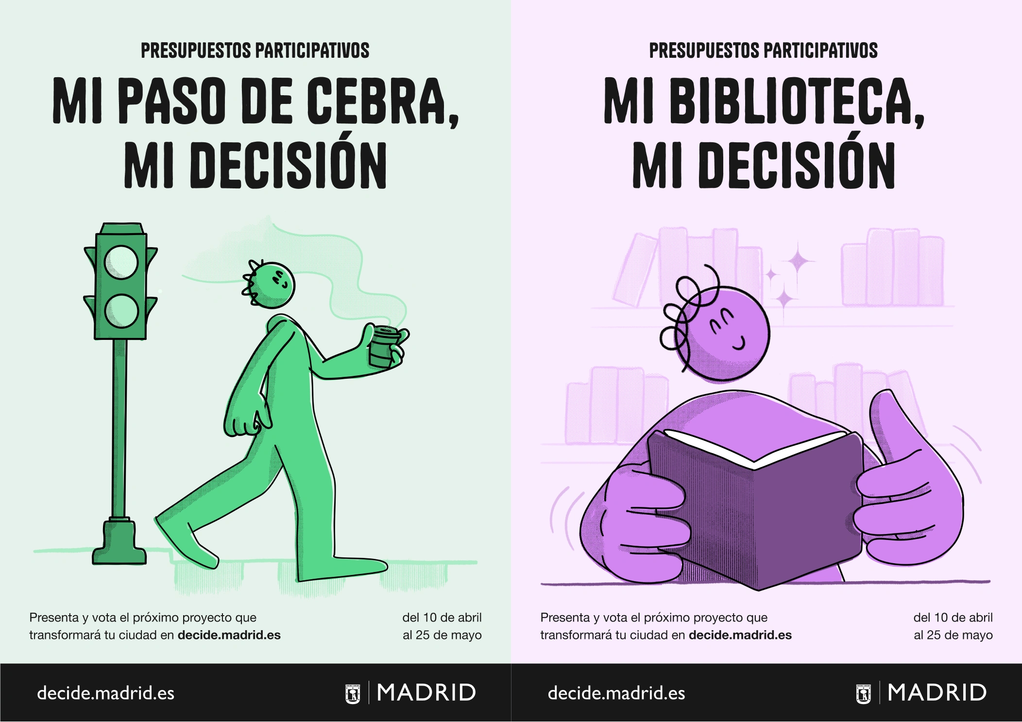
The concept, "My Madrid, my decision," puts the resident at the center of each initiative: my bike lane, my park, my library.
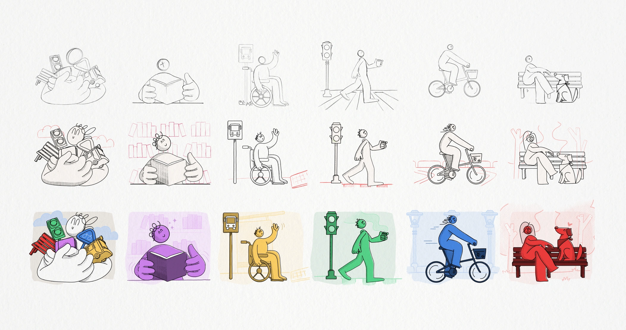
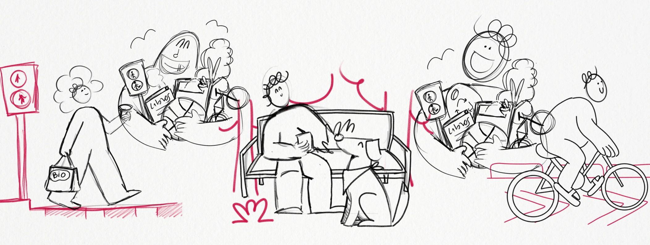
Illustration was chosen as the technique because it feels friendlier and closer than institutional photography. It helped the campaign feel personal, not like a notice from the city council.
Art direction
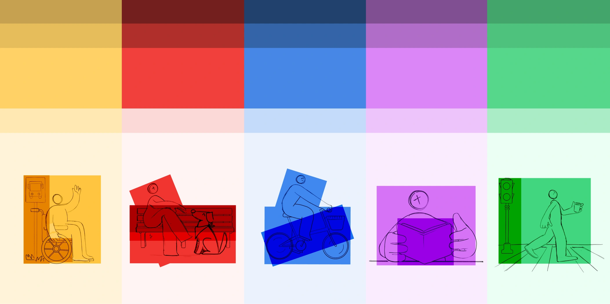
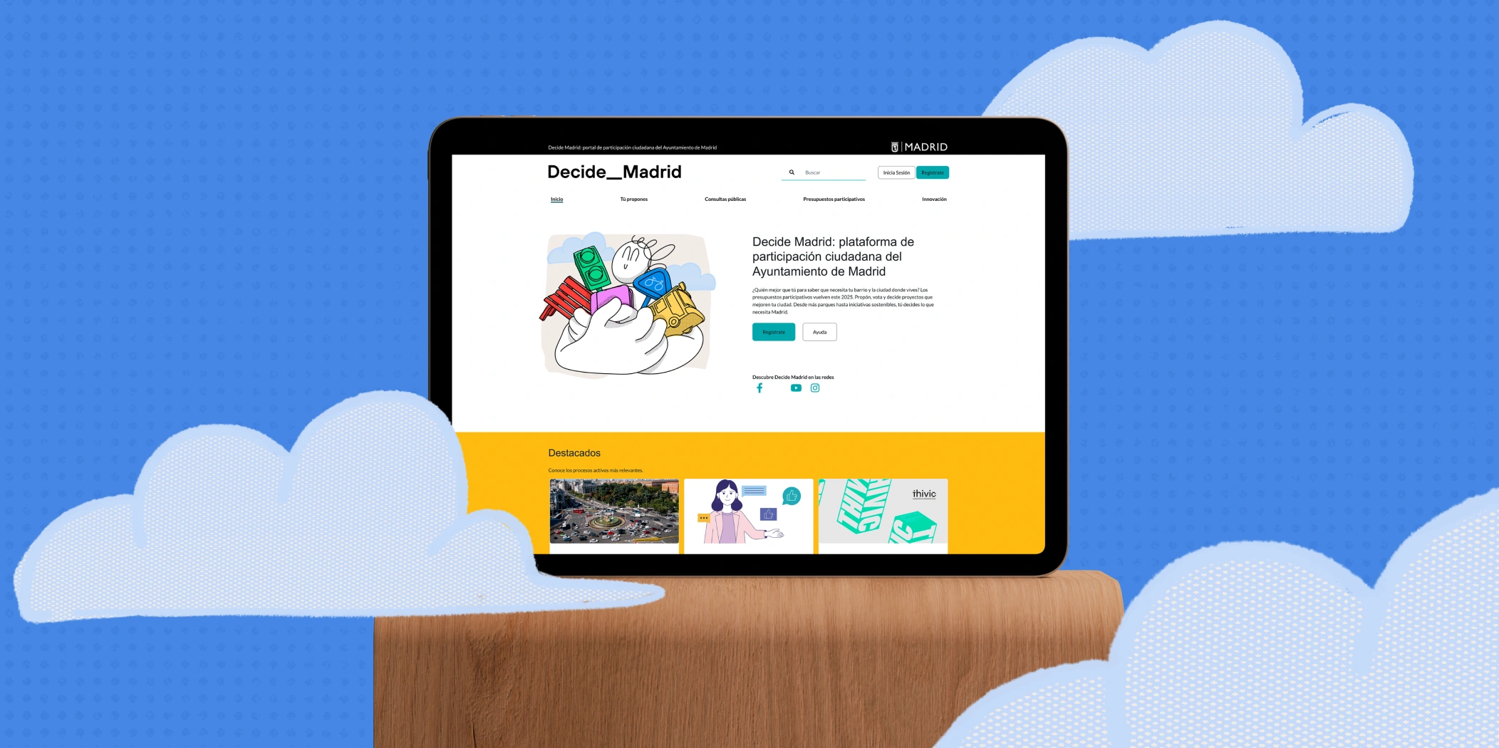
I defined a visual world of line and color blocks where the focus always falls on the main character. A palette with clear hierarchy supports it: ultra-soft tones for backgrounds, the main color for the character, and dark tones for supporting elements that guide the reading without competing for attention.
For the headlines I adapted the Tanker typeface. Its rounded shapes reinforced the closeness of the message without losing legibility in text-heavy pieces.
Every decision (color, hierarchy, lettering) served the same goal: make the campaign feel close, not institutional.
Your city. Your budget. Your call.
Context
Participatory budgeting lets residents of a city decide directly how part of the municipal budget is spent. They propose and vote on initiatives for their neighborhood or district.
Brief
Create an institutional campaign that invites people to take part, with a close and participatory tone, not a cold institutional one.
The campaign
The concept, "My Madrid, my decision," puts the resident at the center of each initiative: my bike lane, my park, my library.
Illustration was chosen as the technique because it feels friendlier and closer than institutional photography. It helped the campaign feel personal, not like a notice from the city council.
Art direction
I defined a visual world of line and color blocks where the focus always falls on the main character. A palette with clear hierarchy supports it: ultra-soft tones for backgrounds, the main color for the character, and dark tones for supporting elements that guide the reading without competing for attention.
For the headlines I adapted the Tanker typeface. Its rounded shapes reinforced the closeness of the message without losing legibility in text-heavy pieces.
Every decision (color, hierarchy, lettering) served the same goal: make the campaign feel close, not institutional.